M.Sc. dissertation · Banaras Hindu University · May 2025
Bengaluru: Urban Heat, Green Spaces and Urban Development
Spatiotemporal Assessment of Urban Green Space Dynamics and Their Mitigating Influence on Urban Heat Island: A Decadal Study of Bengaluru
.png)
Overview
A decade of heat and green space, mapped.
In my M.Sc. dissertation at Banaras Hindu University, I studied how Bengaluru's thermal environment and urban green spaces changed over a decade. The analysis compares April observations from 2014, 2019 and 2024, using satellite imagery to examine land-surface temperature, vegetation and built-up patterns.
I wanted to look beyond how much green space a city contains and explore how its spatial arrangement relates to the distribution of heat. To do this, I combined remote sensing with landscape metrics and spatial statistical techniques, including Moran's I and a Coupling Coordination Degree Model.
The study brings together maps, spatial patterns and statistical comparisons to examine the relationship between urban growth, green-space configuration and surface temperature. Its results also point to the importance of interpreting urban green infrastructure in spatial context rather than treating all green spaces as interchangeable.
Research questions
What the study asks
- How did LST, NDVI and NDBI vary across Bengaluru between 2014, 2019 and 2024?
- How did urban green-space configuration relate to the thermal environment?
- What spatial clusters and hotspots emerged in the analysed indicators?
- How did the coupling and coordination between green-space and thermal indicators vary spatially and over time?
Methods and data
How the analysis was done
Satellite & spatial analysis
- Landsat-based analysis
- Land-surface temperature (LST)
- NDVI · NDBI
- Land-use/land-cover analysis
- Green Space Index (GSI)
Landscape metrics
- Patch Density (PD)
- Largest Patch Index (LPI)
- Landscape Shape Index (LSI)
Statistics & coordination
- Global & Local Moran's I / LISA
- Coupling & Coupling Coordination (CCDM)
- AHP weighting for GSI analysis
Figures from the dissertation
Maps and analysis
.png)
As annotated: LST–NDBI 0.513 (2014), 0.662 (2019), 0.613 (2024); LST–NDVI −0.165, −0.270, −0.167; LST–GSI −0.186, −0.317, −0.162; NDVI–GSI 0.507, 0.745, 0.720. Associations, not causal estimates.
.png)
Urban heat intensity overlaid with Green Space Index classes (high / medium / low) for each study year.
.png)
Change maps for the coupling (C) and coordination (D) indicators across 2014–2019 and 2019–2024, class breaks as shown in each panel.
.png)
Built-up change across the two inter-survey periods, class breaks as shown in each panel.
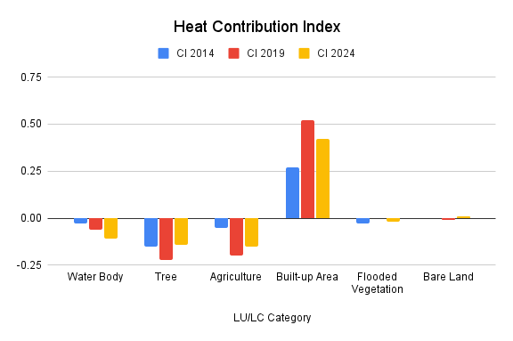
Built-up areas show the highest positive contribution in all three periods, while water bodies, tree cover and agriculture sit near zero or below — read qualitatively from the chart.
Findings
What the analysis examines
The study compared April LST, vegetation and built-up indicators over three time points. The spatial analyses found statistically significant positive clustering for LST, GSI and NDBI in the analysed dataset. The CCDM analysis showed that coordination between the relevant systems changed over the study periods, with stronger coordination described from 2014 to 2019 and a decline from 2019 to 2024. The spatial maps were used to compare the distribution of thermal hotspots and green spaces across the study area.
Mean land-surface-temperature magnitudes are not stated here: the abstract and results chapter report inconsistent values, and no headline warming figure is published until the underlying calculations are reconciled.
Implications
Planning with location in mind
The study highlights why urban green-space planning needs to consider location, size, distribution and configuration alongside overall green cover. Spatially concentrated heat patterns and changes in the coordination between green-space and thermal indicators suggest that planning decisions should be informed by the local context of individual urban areas.
Limitations
What this study does and doesn't show
The analysis uses selected April periods in 2014, 2019 and 2024 rather than a continuous daily time series. It analyses remotely sensed land-surface temperature, which is not the same quantity as near-surface air temperature. The analysis describes spatial associations and coordination patterns; these alone do not prove causation.
Questions about this study?
Write with context — I read everything.